Reference
Contents
- Citations and bibliography
- Interesting and excellent real world examples
- How to select the appropriate chart type
- Helpful data visualization resources
- Visualization in Excel
- Visualization in Tableau
- Information Visualization & Visual Analytics Courses
- Working with R and ggplot2
- R in the wild
- Data
- Colors
- Fonts
- Markdown
Citations and bibliography
You can open the file in BibDesk on macOS, JabRef on Windows, or Zotero or Mendeley online.
You can download a BibTeX file of all the non-web-based readings in the course.
Interesting and excellent real world examples
- The Stories Behind a Line
- Australia as 100 people You can make something like this with d3 and the potato project.
- Marrying Later, Staying Single Longer
How to select the appropriate chart type
 The Data Visualisation Catalogue
Many people have created many useful tools for selecting the correct chart type for a given dataset or question. Here are some of the best:
- The Data Visualisation Catalogue: Descriptions, explanations, examples, and tools for creating 60 different types of visualizations.
- The Data Viz Project: Descriptions and examples for 150 different types of visualizations. Also allows you to search by data shape and chart function (comparison, correlation, distribution, geographical, part to whole, trend over time, etc.).
- From Data to Viz: A decision tree for dozens of chart types with links to R and Python code.
- The Chartmaker Directory: Examples of how to create 51 different types of visualizations in 31 different software packages, including Excel, Tableau, and R.
- R Graph Catalog: R code for 124 ggplot graphs.
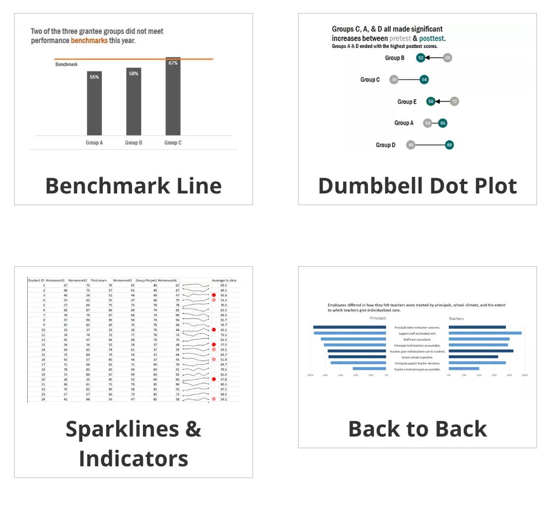
- Emery’s Essentials: Descriptions and examples of 26 different chart types.
Helpful data visualization resources
- Storytelling with Data: Blog and site full of resources by Cole Nussbaumer Knaflic.
- Ann K. Emery’s blog: Blog and tutorials by Ann Emery.
- Evergreen Data: Helful resources by Stephanie Evergreen.
- PolicyViz: Regular podcast and site full of helpful resources by Jon Schwabisch.
- @HelpMeViz: Community of people who give advice on how to visualize data.
- Visualising Data: Fantastic collection of visualization resources, articles, and tutorials by Andy Kirk.
- Info We Trust: Detailed explorations of visualizations by RJ Andrews, including a beautiful visual history of the field.
- FlowingData: Blog by Nathan Yau.
- Information is Beautiful: Blog by David McCandless.
- Junk Charts: Blog by Kaiser Fung.
- WTF Visualizations: Visualizations that make you ask “What the Freak?” 🙊 Hi BYU! 🙊
- This could be helpful for your rubric assignment.
The Data Visualization Checklist: A helpful set of criteria for grading the effectiveness of a graphic. - Data Literacy Starter Kit: Compilation of resources to become data literate by Laura Calloway.
- Seeing Data: A series of research projects about perceptions and visualizations.
Visualization in Excel
-
 Stephanie Evergreen’s Excel tutorials
How to Build Data Visualizations in Excel: Detailed tutorials for creating 14 different visualizations in Excel. - Ann Emery’s tutorials: Fantastic series of tutorials for creating charts in Excel.
Visualization in Tableau
Because it is focused entirely on visualization (and because it’s a well-supported commercial product), Tableau has a phenomenal library of tutorials and training videos. There’s a helpful collections of videos here, as well.
Information Visualization & Visual Analytics Courses
CS 7450: Dr. John Stasko’s Georgia Tech graduate Information Visualization course.
CS 4460: Dr. John Stasko’s Georgia Tech’s undergraduate Information Visualization course.
CS 4460: Dr. Alex Endert’s Georgia Tech undergraduate Information Visualization course.
CS 5630 / CS 6630: Dr. Alexander Lex at Utah University’s undergraduate and graduate Visualization for Data Science course.
INLS 641: Dr. David Gotz at UNC Chapel Hill’s graduate course on Visual Analytics
Working with R and ggplot2
- Pro-tip: Searching for help with R on Google can be tricky because the program is, um, a single letter. Try searching for “rstats” instead. If you use Twitter, post R-related questions and content with #rstats. The R community on StackOverflow is also incredibly kind and helpful.
Stat 545: Dr. Jenny Bryan at the University of British Columbia has an entire introductory course in R, visualization, and data analysis online. - STA 112FS: Data Science: Dr. Mine Çetinkaya-Rundel at Duke University has an entire introductory course in R, visualization, and data science online.
- CSE 631: Principles & Practice of Data Visualization: Yet another introductory course for R and ggplot2 by Dr. Alison Presmanes Hill at Ohio State University.
- R and RStudio cheat sheets: A large collection of simple cheat sheets for RStudio,
ggplot2, and other R-related things.
R in the wild
A popular (and increasingly standard) way for sharing your analyses and visualizations is to post an annotated explanation of your process somewhere online. RStudio allows you to publish knitted HTML files directly to RPubs, but you can also post your output to a blog or other type of website. If you want to be really fancy, you can use blogdown, which makes a complete website with R Markdown files. That’s actually how this site is built (see the source code). You can build your own site with this tutorial.
Reading these kinds of posts is one of the best ways to learn R, since they walk you through each step of the process and show the code and output.
Here are some of the best examples I’ve come across:
- Text analysis of Trump’s tweets confirms he writes only the (angrier) Android half (with a follow-up)
- Bob Ross - Joy of Painting
- Bechdel analysis using the tidyverse There are a bunch of examples using data from FiveThirtyEight.
- Sexism on the Silver Screen: Exploring film’s gender divide
- Comparison of Quentin Tarantino Movies by Box Office and the Bechdel Test
- Who came to vote in Utah’s caucuses?
- Health care indicators in Utah counties
- Song lyrics across the United States
- A decade (ish) of listening to Sigur Rós
- When is Tom peeping these days? There are a bunch of final projects from other R and data visualization classes here and here.
- Mapping Fall Foliage
- General (Attys) Distributions
- Disproving Approval
Data
Pulling your own data:
- Yifu Yan’s Resources for webscraping in R: This cheat sheet of resources was inspired by Hartley Brody’s similar cheat sheet for web-scraping in Python
- Mike Kearney’s
rtweetpackage for using the Twitter API to pull Twitter data: Mike has created the foremost package (in any language, in my opinion) for using the Twitter API. He has also created a ton of helpful resources including his incredibly helpfulrtweetworkshop slides.
Past datasets:
- Google Dataset Search: Google indexes thousands of public datasets; search for them here
- Kaggle: Kaggle hosts machine learning competitions where people compete to create the fastest, most efficient, most predictive algorithms. A byproduct of these competitions is a host of fascinating datasets that are generally free and open to the public. See, for example, the European Soccer Database, the Salem Witchcraft Dataset or results from an Oreo flavors taste test.
- 360Giving: Dozens of British foundations follow a standard file format for sharing grant data and have made that data available online.
- US City Open Data Census: More than 100 US cities have committed to sharing dozens of types of data, including data about crime, budgets, campaign finance, lobbying, transit, and zoning. This site from the Sunlight Foundation and Code for America collects this data and rates cities by how well they’re doing.
- Political science and economics datasets: There’s a wealth of data available for political science- and economics-related topics:
- François Briatte’s extensive curated lists: Includes data from/about intergovernmental organizations (IGOs), nongovernmental organizations (NGOs), public opinion surveys, parliaments and legislatures, wars, human rights, elections, and municipalities.
- Thomas Leeper’s list of political science datasets: Good short list of useful datasets, divided by type of data (country-level data, survey data, social media data, event data, text data, etc.).
- Erik Gahner’s list of political science datasets: Huge list of useful datasets, divided by topic (governance, elections, policy, political elites, etc.)
Colors
- PolicyViz Design Color Tools: Large collection of useful color resources
-
 Adobe Color
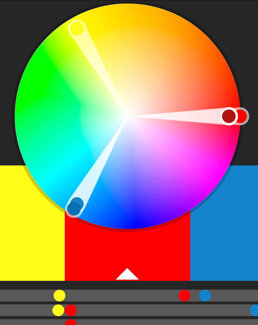
Adobe Color: Create, share, and explore rule-based and custom color palettes. - viridis: Percetually uniform color scales.
- Scientific Colour-Maps: Perceptually uniform color scales like viridis. Use them in R with scico.
- ColorBrewer: Sequential, diverging, and qualitative color palettes that take accessibility into account.
- Colorgorical: Create color palettes based on fancy mathematical rules for perceptual distance.
- Colorpicker for data: More fancy mathematical rules for color palettes (explanation).
- iWantHue: Yet another perceptual distance-based color palette builder.
- ColourLovers: Like Facebook for color palettes.
- Photochrome: Word-based color pallettes.
Fonts
- Google Fonts: Huge collection of free, well-made fonts.
- The Ultimate Collection of Google Font Pairings: A list of great, well-designed font pairings from all those fonts hosted by Google (for when you’re looking for good contrasting or complementary fonts).
Markdown
-

The Plain Person’s Guide to Plain Text Social Science: A comprehensive explanation and tutorial about why you should write data-based reports in Markdown. - Markdown tutorial: An interactive tutorial to practice using Markdown.
- Markdown cheatsheet: Useful one-page reminder of Markdown syntax.